There is certainly a necessity for presenting the written word in a visual way – the 1,000 word cliché springs to mind – and at the very least it breaks up an onslaught of text. Unfortunately, within texts from both archaeological and heritage studies, the very way an oft-complex theory is reduced to the level of a simple line drawing is usually where problems creep in. An illustration or diagram is usually presented in an attempt to cement an understanding of a few surrounding paragraphs of written theory. On the whole, what is actually offered is a baffling array of word boxes and connecting paths of either solid or broken line usually with arrowheads directing the eye of your brain to follow a fixed path of inescapability – not unlike the trap that the medieval pentagram was originally designed for! But what is really at issue here is that unless you are skilled with diagrammatic literacy, it’s all just going to be plain nonsense. In isolation, these diagrams are neither big nor clever and they’re certainly not pretty – just where is the artistic element or the playful interest?
Here is a first random example:
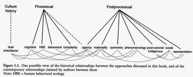
Martians instigate the War of the Words…
Just what is going on here?
Indeed, there are successful diagrams out there in archaeological academia that score full marks for clarity and simplicity, but, hey, we’re not interested in flagging those ones up – they have done their job and we’ve moved on much the wiser! We don’t want the good – just the bad and the ugly. What we are interested in is the unfathomable, the pointless, the flawed or the downright dippy – otherwise there’d be no point to this blog at all – so let’s just move on with a sincere ‘hello and welcome to my blog’! But let’s be clear, this is not about drawing or illustration. It has nothing to do with archaeological site drawings or any attempt at the representation of existing stuff in situ. This blog is purely about theory and the dubious ways of representing such hypothetical constructs.
For example, here is a baffling image:
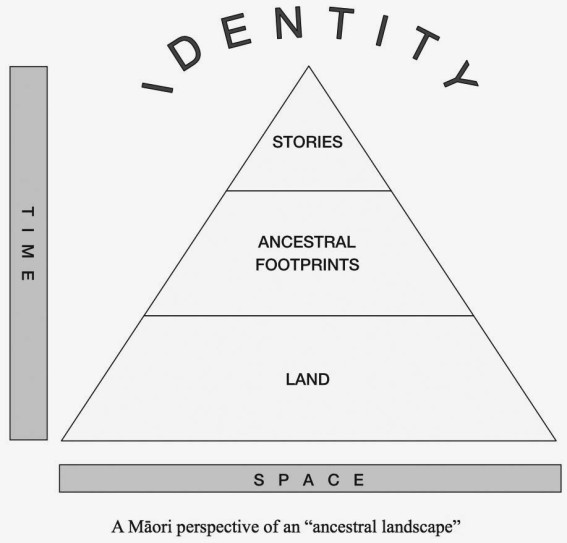
Måori ancestry has been unearthed as far away as Egypt…
Just what are the upright column marked ‘Time’ and the horizontal bar marked ‘Space’ exactly saying in this diagram? Sure, the hierarchical pyramid is the construct and is basically sensical within itself, but ‘time’ and ‘space’ – how on earth do they fit in? They are surely a representative model from a different sort of graphic hierarchy?
It seems that some of these diagram types are based on physics-based mathematical schematics involving complex names such as ‘vertices’ and ‘planer models’ and others are derived from 2 sorts of biological Dynamic Process Diagrams but, even in combination, and from an aesthetic viewpoint, they really do NOT succeed in trying to represent a visual perspective of a theoretical archaeological construct… don’t you think?
And it’s not just archaeological theory that suffers from this affliction, look at this…
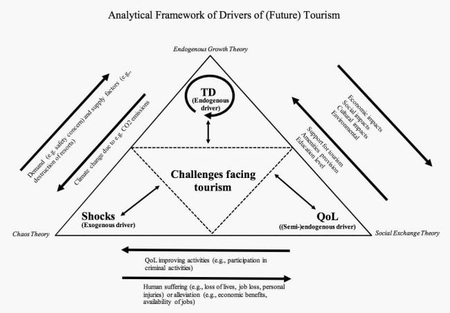
Tourists battle to bypass the M25 ring road – Heathrow being particularly hazardous…
It is as if authors feel a need to emphasise any theoretical point with attempted visual literacy and follow the time-honoured old way of doing so purely because it is what every other author has done up until now.
But on a serious note, these diagrams from the social sciences represent something of a struggle for legitimacy within disciplines that are often seen as ‘soft’ compared to the ‘hard’ sciences. That these images give the appearance of hard facts to a ‘soft’ subject is directly attributable to the 19th Century archaeological theory of ‘positivism’, subsequently adopted by the ‘New Archaeology’ movement, which believed that social sciences, including archaeology, should follow the historical path of development and methods of the natural sciences. So let’s just blame them, then.
Personally, for theory to be well illustrated and memorable, I really need to see an image that ‘speaks’ to me in a three dimensional way – not an annotated triangle of mathematical intangibility with associated tangents. To illustrate my point, here is one of my own diagrams demonstrating Capitalist theory. I call it the ‘Circle of $**t’:

Especially poignant with 3D specs – the ones with red and green lenses!
And below is an example of a diagram that needs no explanation, or words. It is self-contained. And the ironic thing is that any of the titles featured could be applied to this image – and would make better sense! Let’s try it:
The Heritage Force Field.
I could spend hours examining these juxtapositions but we really should return to the realms of baffling word box layout, like the image below – I wonder what latent immense human power is tangentially inherent within the very middle circle…
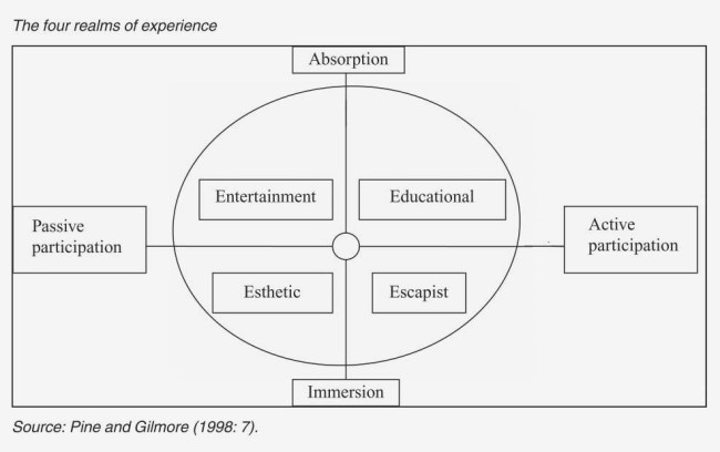
These ‘realms’ don’t exactly look inviting!
And, speaking of circles, what about this…
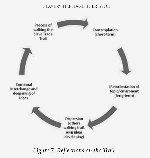
Are we really to believe that this incredibly socially aware walker is still circling Bristol as we speak? To me, it starts off perfectly logically within the indicated clockwise fashion (assuming you’ve started at the top), until we have just gone past the ‘Continual interchange and deepening of ideas’ part of the walk… …and then we are suddenly back on it from the very start! Just as in the medieval pentagram, we are now fully enslaved to the slave trail and will forever walk this circle of $**t…
And so, to finally close this first blog, here is an unfathomable table of complexity…
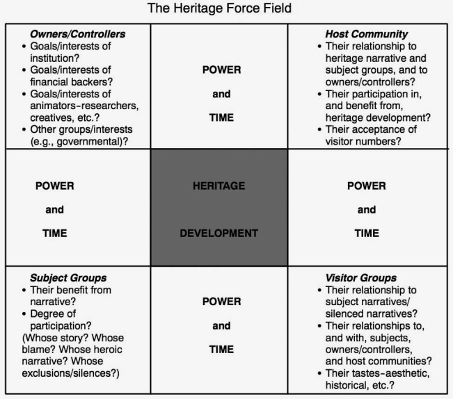
In a nutshell, simply noughts and crosses.
This image is really not helped by the poorly designed layout of wording, and it certainly does not convey any concept of what is termed a ‘force field’. Indeed, you could say it is neither ‘magnetic’ nor even a ‘draw’ in any way, shape or form. To me, this is a meaningless wordy representation of some potentially quite complex theory – but who, apart from the author, would spend time (let alone power) trying to draw out any long-lasting memorable conclusion from this schematic? Hopefully, the author will have explained any notions of how such a ‘force field’ exists in the text and we can all go home!
If you have been affected by content shown in this Blog then please indulge me with your own diagrammatical diatribe on an incomprehensible image (i.e. make comment with a URL that links to it) – or maybe you’ve come across a brilliant example of a diagram?
Whichever, I really look forward to seeing them!
